
Design · A practical guide
Classic Deal Toy Shapes:
Why the Basics Endure
Familiar forms, thoughtful proportions and the details that make them your own.
“We’d like something more classic.”
If you're commissioning a deal toy, that can be a perfectly useful brief. You may want the transaction to speak for itself. You may prefer a restrained piece that sits comfortably on a desk, or something that belongs alongside your team's earlier closings.
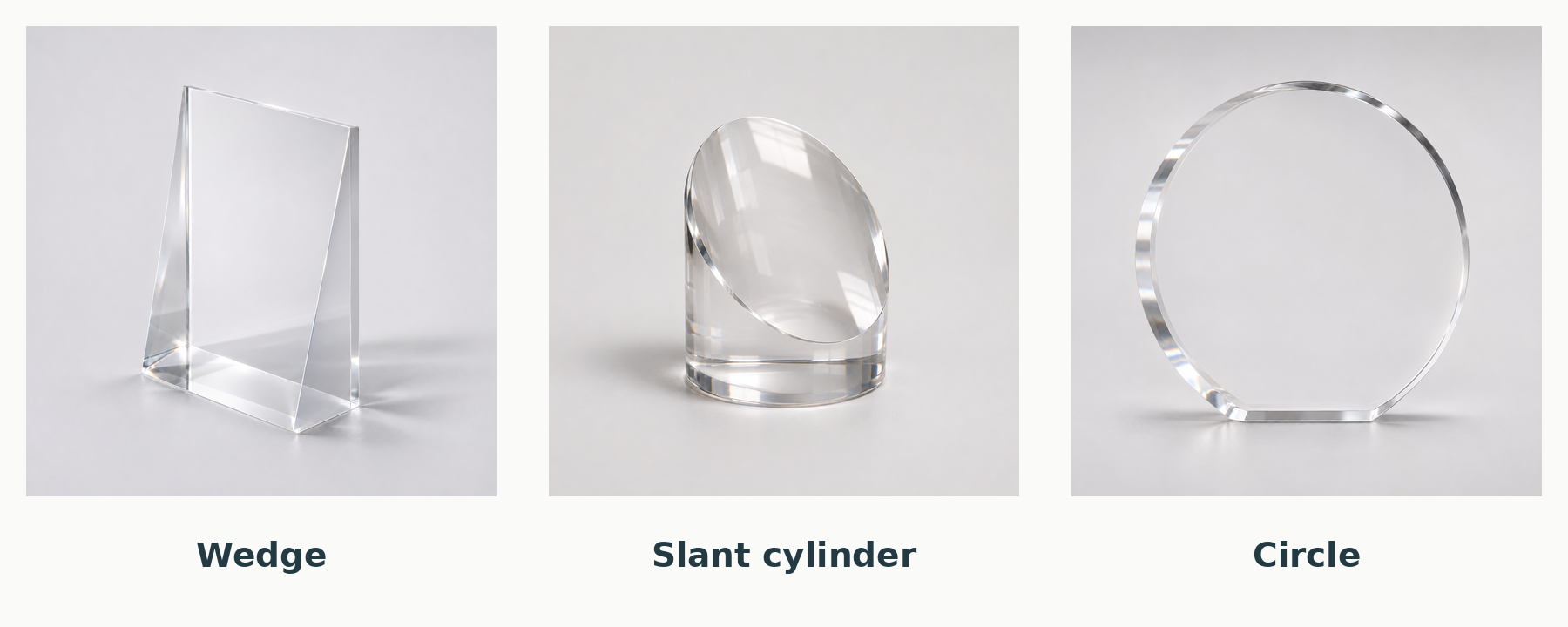
Basic geometric shapes provide a good place to begin. A rectangle offers a clear field for an announcement. A circle introduces a softer outline. A wedge changes the way the piece presents itself when you see it from the side.
These forms remain useful because they can accommodate very different transactions, identities and ways of arranging information. The shape gives the design a structure. The decisions made within that structure give it character.
What makes a shape classic?
I think of a classic shape as one that continues to offer a good answer to a recurring design problem.
A deal toy often needs to bring together company names, logos, a transaction description and a date in an object someone will keep. A straightforward form can give those details a clear setting without asking them to compete with an elaborate outline.
Familiar forms are also adaptable. A rectangle can be tall and narrow or low and wide. A cube can emphasize an object inside it. A slant cylinder can present artwork on an angled face. Their usefulness doesn't depend on one company, sector or moment.
“Classic” doesn't mean every version will look good. Proportion, spacing and execution still matter. It means the underlying form gives us a useful place to work.
Learn a few names, then look at the whole object
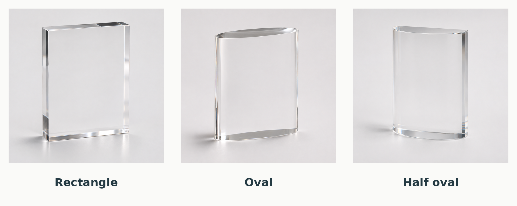
Rectangle, oval, half oval, wedge, slant cylinder, circle, cube, standing cube and cut sphere are useful names to know. You don't need to memorize them.
Some describe the outline from the front. Others describe the footprint, side profile or the way the piece stands. An oval may refer to an upright form with an oval footprint, rather than a thin oval silhouette. A front view alone can hide the difference between a rectangle and a wedge.
I find it more useful to group them by what they bring to a design than to treat them as a fixed menu.
A clear field for the transaction
A rectangle gives text and graphics a straightforward boundary. It can suit a carefully composed transaction announcement, a photograph or a combination of the two.
The proportions deserve attention. A landscape photograph and a vertically arranged series of company names won't necessarily want the same shape. The piece should support the artwork rather than force it into a convenient blank space.
A softer outline
Circles, ovals and half ovals can soften the overall impression. Their curves change how the outside edge relates to the artwork.
That doesn't mean the type should automatically follow the curve. Sometimes a centered, orderly layout inside a curved form is the strongest solution. The outline and the composition can do different jobs.
An angled presentation
A wedge or slant cylinder introduces an angled surface or profile. That change can make a simple object feel more considered when it is viewed on a desk.
Ask to see the relevant side view. A rendering from one angle may make two forms look similar even though they occupy space differently. The dimensions, angle and placement of the artwork should be considered together.
An object with volume
A cube, standing cube or cut sphere can draw attention to the three-dimensional form itself. Clear material creates opportunities to see through the object and around what is printed or placed within it.
Orientation matters. A cube resting on a face feels different from a cube standing on a cut corner. The latter needs a suitable flat area to stand on. The design should look balanced and have a practical footprint, not merely make an interesting rendering.
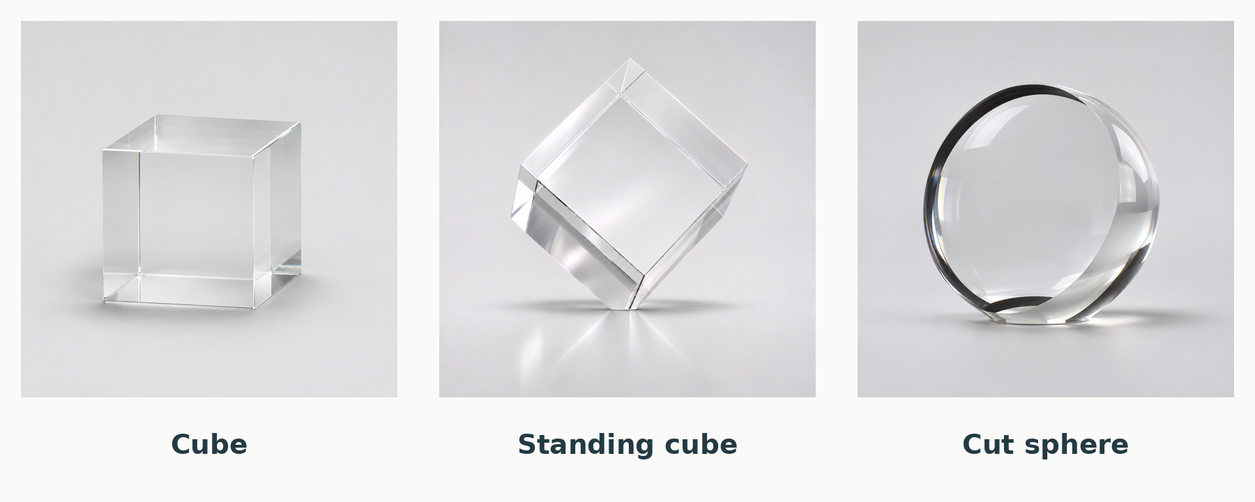
These are starting points, not the full range of possibilities. Faceted columns, arches, custom outlines and combinations of forms can all belong in the discussion. You don't need to settle the category before asking for help.
A familiar outline can carry a very specific story
At Polaris, choosing a basic geometric shape doesn't mean choosing an off-the-shelf piece. The dimensions, artwork, materials and construction are developed for the project.
Consider a rectangle. It might contain a sparse transaction announcement, a photograph of a property or a suitable physical object embedded in Lucite. The outer boundary is familiar, but the pieces can have very different purposes and personalities.
A custom-cut silhouette can be useful when the outline itself contributes something important, perhaps a recognizable property profile or a product shape. A geometric form can be the better choice when the information or imagery deserves the attention.
What changes when the shape stays simple?
With a relatively quiet outline, the smaller decisions become easier to see.
Proportion: How wide, tall and thick should the piece be? The amount of information and the way it will be displayed both matter.
Space: How much clear material should surround the artwork? Too little can feel crowded. More isn't automatically better.
Emphasis: What should someone notice first? A company identity, a property image and a transaction description shouldn't all have to compete at the same volume.
Depth: Does the artwork sit on a surface, within the material or across separate layers? That choice changes the way the piece appears from an angle.
Finish: Edges, surfaces and the relationship between components need the same care as the visible artwork.
A familiar shape gives these decisions room to do their work. It doesn't make them less important.
The material changes the experience
Lucite and crystal can both work well in a classic design, but they offer different ways to make it.
Cast Lucite allows suitable objects and printed images to be embedded within the material. If an actual object is central to the brief, its compatibility with the casting process needs to be assessed, usually with a test embedment.
Crystal offers a different sense of weight and a polished glass surface. Internal 3D laser engraving is another possibility. A design built around surface printing will behave differently from one with imagery inside the piece, even if the outline is the same.
You can explore those choices in the materials guide. The useful question is which construction will produce the effect you want, not which material is automatically more prestigious.
A simple appearance doesn't settle cost or timing
A straightforward form can avoid some modeling, tooling or assembly work. Other features can still add complexity: a demanding embedment, multiple printing operations, special finishing or individual deliveries.
Compare the complete proposal at your actual quantity. Understand the setup charges, packaging and shipping, as well as the per-piece price. Ask how prototype review, production and transit fit the required date.
The complete-quote guide explains those questions in more detail.
How to start without choosing every detail
You don't need a final shape or a finished design brief. A few useful details are enough to begin:
- What the transaction or milestone represents.
- Who will receive the pieces.
- Examples you like, with a sentence about what appeals to you.
- The wording, logos and images that need to be considered.
- Approximate quantity, budget and required delivery date.
- Whether the pieces will go to one location or individual recipients.
If the new piece needs to sit alongside earlier deal toys, include a photograph of those too.
A designer can then suggest a small number of relevant directions. You can compare what each one achieves rather than work through every possible shape.
Classic for a reason
Basic geometric forms have continued usefulness because they leave room for many kinds of meaning. They can carry a formal announcement, frame an image or give a significant object a place to be seen.
A classic shape is a sound starting point when it helps the finished piece communicate clearly and feel appropriate to the achievement. From there, the work is in the choices: what to emphasize, what to leave out and how to make the object worth keeping.
For commissioned work, I collaborate with the creative team at Polaris Custom Awards.